
Mavlers offers spot-on Design, Web building, SEO, PPC, and Marketing automation services.
Visit Mavlers
Email Uplers offers Templates, Campaign management, Automation, and Migration services.
Visit Email UplersWhile Uplers remains your go-to hiring platform, if you need help with digital marketing services, head to our sister concerns…

Mavlers offers spot-on Design, Web building, SEO, PPC, and Marketing automation services.
Visit Mavlers
Email Uplers offers Templates, Campaign management, Automation, and Migration services.
Visit Email UplersFor digital marketing services, Visit Mavlers and for email marketing services, Visit Email Uplers




A well-crafted, compelling and credible content will always attract visitors on a blog. It gives you conversion only when users can easily have it through a good and accessible user interface (UI).
Strategize and build your blog navigation structure creatively to provide better user experience (UX) to boost conversion.


First impression lasts long- design your blog structure beautifully to hold viewer’s attention. Provide them with an easy, intuitive and effective user interface to go through the different sections of your blog.
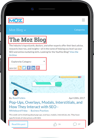

Moz has implemented various homepage elements on their blog. Want to know more of such home page elements that have boosted conversion immensely for famous influencers?
Tip: Creating a customized theme for your WordPress blog is Monk’s recommendation for setting up your blog structure as per your need or desire.


Social channels are the best platforms to make your content viral through which people will also share their opinion and recommendation on the topic which would eventually boost conversion.


Commenting is one of the best
ways to increase the engagement
level of people.


Click to Tweet WordPress plugin is an easy way to enable tweeting of a particular statement on your blog and that could easily be a statistic or a fact.


Disqus is a tool that helps in
increasing engagement through
commenting.
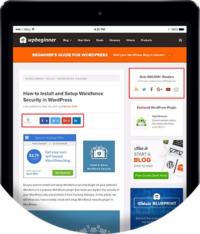

WPBeginner has placed Social Sharing Buttons on the sidebar as well below the post. Want to know more about foolproof placement of Social Sharing Buttons?
Tip: Download and install Disqus plugin in your WordPress dashboard and make commenting easier yet interactive while
connecting blogs and community through.


Enable Optin forms on your blog and start collecting more subscribers.
Pop-up tools are great to present options to the users on different sections of the blog.
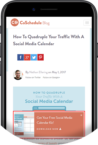

CoSchedule has implemented various homepage elements on their blog. Want to know more of such home page elements that have boosted conversion immensely for famous influencers?
Tip: Offer some freebies when users are about to switch to some other sites. Download and install the Optin Forms plugin to start
collecting emails on your blog. You can pick your email solution by simply customizing it in accordance to your blog.


The loading speed of a web page is very important and users are known to be looking forward
to a web page that loads within 3 seconds.
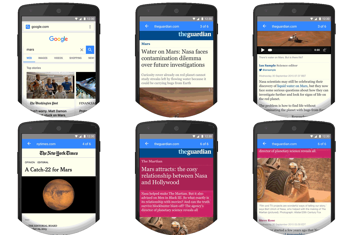

Websites like The New York Times use AMP to enhance the load speed. View more of such websites that load fast and yet manage to keep the quality intact.
Create an effective blog for capturing better business opportunities. Let’s get the expert
Monks to assist YOU with your business blog designing and development.
Let us create a blog that generate business leads for you.
Tip: Accelerate your blog speed with AMP for WordPress plugin on the mobile web. Also, it will showcase your website content in an optimized style.