How To Make A Killer Landing Page For Restaurant Business?
- Jack Mentha
- August 9, 2016
- 4 Minute Read

What is the conversion rate for online table bookings and reservation for your restaurant website?
Are your customers finding it convenient to place online orders by accessing the form on your landing page?
When it comes to an online marketing strategy for restaurant business, there are various unique elements that distinguish their landing pages from other businesses.
A restaurant landing page has to look delicious, cordial, and informative so that your customers stay engaged with the page and convert. Your prospective customers come to your landing page as they need some information. Even if they are not placing an order or booking a table at this moment they might want to engage with your business, and a landing page is just the thing you need to capture valuable information that is required for future communication.
A successful restaurant landing page is the one that has a perfect mix of striking visuals, thoughtful information, lead-capturing forms and action provoking calls-to-action. Let’s have a microscopic look at some of the inevitable elements that should be a part of all restaurant landing pages.
Stunning images

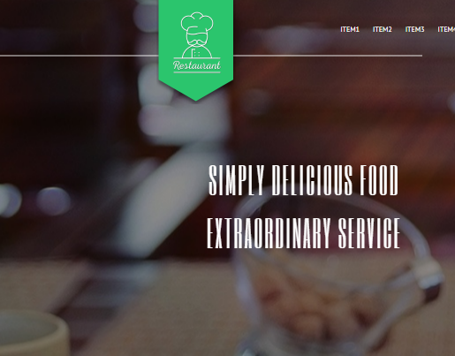
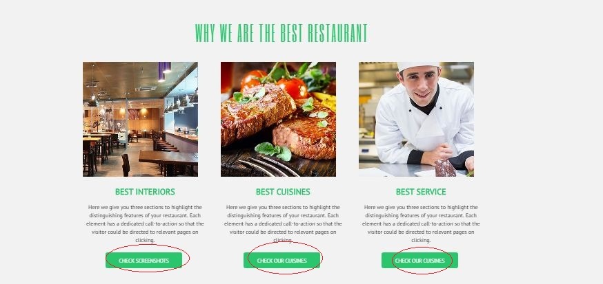
How many times have we felt tempted to visit a restaurant just by looking at the delicious cuisines in the flyers? I believe most of us, especially food junkies, would swear by the fact that these images influence their decisions of visiting a restaurant. The same rule applies for your landing page. Any restaurant marketing communication is incomplete without the images of their cuisines and interior. There should at least be 2 dedicated sections, including the banner, for images.
Eye-catchy headline

In case of a restaurant, the first thing that your customers might want to see is special offers, special menus, booking information, and more. Your headline is the first readable element on your landing page and this has to be very relevant to your customer’s needs. Remember, they have to click on the search results, or social media link, or any other source only because they were tempted by some information. On landing at your page, the headline should fulfil this promise so that they would engage for a longer time.
Content
Content is the main filler inside your landing page because it will answer a majority of the questions that your customers might have in their mind. Being in the restaurant business, you are probably aware about the questions that you receive over the phone or queries and opinions in the suggestion box. You could leverage these sources to create compelling content. Your content will work towards establishing the trust factor and slide the visitors into your conversion funnel to convert them into leads and customers.
Calls-to-action

A call-to-action for restaurants could be different from others. Here we are talking about booking, reservation, online orders and menu downloads. Calls-to-action should be customized so that you serve the right purpose for your visitors on your website. Here the most relevant calls-to-action would be something like, “Book Your Table Now,” “Place Your Order,” “Download Our Menu,” and more that would be relevant to your business and resonate the needs of the visitors.
Forms

What exactly would a restaurant’s customer fill up a form for? Maybe he wants to inquire for a marriage anniversary party, or he wants to reserve a table on a specific day at a given time. Forms play a very important role for your restaurant landing pages as you will acquire some valuable information from your prospects that will help you provide tailored messages in the future. You could also insert a field to know the favourite cuisine of your customer so you could inform about special offers revolving their favourite dish.
Subscription Section

Your restaurant might be generating a lot of buzz and your prospects might want to stay hooked with the latest happenings inside. So, it becomes inevitable to have a section dedicated to subscription of newsletters and updates.
Map
What if the visitors are impressed with all the information given on the landing page and would like to pay a visit to your restaurant at this moment. Along with the physical address, it is essential that you give them the exact way to your physical location with the help of a map. The map will have your restaurant marked along with the nearest landmark so that the customers could easily locate you.
Social Media Sharing
If you are looking to spread the word about your restaurant, it is simple unavoidable to insert social media sharing buttons at the right places so that the visitors would find it convenient to share the information with their friends.
Conclusion
A restaurant landing page could be tricky. However, every landing page has to be niche specific and there are undoubtedly many elements of your business that could be weaved into the page to get online response from your prospects. If you are looking for a highly converting landing page for your restaurant, there is no need to look any further as you have the access to the best landing page your business could ever have.

Thank you for submitting the details!
We will keep your information safe. Feel free to contact us with any questions at hello@uplers.com
Please check your email for next steps shared by Robert.


