8 Do’s and Don’ts for creating HubSpot Landing Pages
- Kevin Oskow
- May 11, 2021
- 6 Minute Read

What is a Landing Page?
Landing pages are web pages on your site designed to convert visitors into leads by offering something valuable in exchange for their personal information. A landing page differs from other pages in that it has only one objective: to turn visitors into customers. A homepage, for instance, provides information about the organization.
Numerous campaigns utilize homepages, “About” pages, or “Contact Us” pages for post-click landing pages. If you redirect visitors to your home page or “Contact Us” page, those pages do not qualify as post-click landing pages. A post-click landing page is an independent web page, disconnected from the rest of the site.
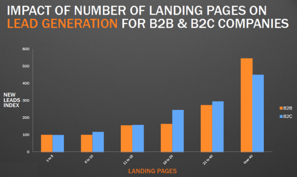
With businesses turning to data-driven marketing, post-click landing pages have become more popular for their ability to generate high ROI. One study found that companies that used 40 or more post-click landing pages generated 120% more leads than those who used less than 5.

A robust landing page optimization platform is generally used to build an effective Landing Page. In this article, we’ll cover HubSpot Landing Pages Builder.
Why should you use Hubspot for Landing Pages?
Using HubSpot’s landing page tool is easy. You can create well-designed landing pages within minutes. HubSpot can build landing pages from scratch, or you can select from a vast library of fully optimized and mobile-responsive templates that are proven to drive conversions.
HubSpot Solutions Partners is a network of businesses and agencies that provide HubSpot support, marketing, sales, and web development services. Find a vetted and experienced Hubspot Solutions Partner and enjoy the benefits of working with a HubSpot pro from day one.
Key features:
- Preview your page to see what it looks like on different devices before publishing.
- Tailor-made landing pages to increase your conversion rates.
- Personalized landing page content for various visitors.
- Allows you to display Calls to Action (CTAs) and forms for every visitor to improve the landing page performance.
- Show dynamic content to any contact details on your CRM and visitors based on their location, device, buying phase, and referral source.
- Gather insights about prospects using dynamic forms.
- From your centralized dashboard, you can identify the best-performing landing pages.
- Conduct A/B testing on every element on your page, including images, calls to action, headlines, and more, to determine which version delivers more results.
- Optimize your page for search by acquiring keyword suggestions.
List of important Do’s and Don’ts for your HubSpot Landing Pages
Do’s:
An attractive headline and a clear call-to-action
To develop the best landing pages, you need to create an attractive headline and an explicit call-to-action.
You have already captured the attention of your website visitors. Now it’s time for you to retain their attention and convert them into new customers. The first thing visitors notice on your landing page is its heading. Make sure it’s easy to follow and simple so that they feel the urge to stay.
The headline should be clear, easy-to-understand, to the point, and relevant to your business.
With no CTA, people will not be able to convert on your page; without a benefit-oriented copy, they will not know why they should. However, without an alluring headline, visitors will not stay on the page long enough to see any other elements.
Your landing page headline, call-to-action, and the offer should be aligned with your ad copy. If all these three factors aren’t aligned, it’ll cause a loss of conversion on your website. So, follow similar principles as your ad copy and focus on the user and talk about the outcome (benefit). You can also hire white label web design partner for the same purpose.
When creating a call-to-action button, you can also keep these tips in mind;
- Make sure your CTA appears in a distinct, clear, and visible place.
- Use attention-grabbing cues such as arrows to attract your visitors’ attention.
- Apply the A/B test to your CTA before sharing it with your website visitors.
Optimize for search
You’ll be directing visitors to your landing page through emails, social media posts, and other promotional tactics. Still, you should additionally optimize your page with target keywords for your paid ads and organic search. When anyone searches for your key phrase, they should locate your landing page. Similarly, when you target a keyword with paid ads, those phrases should exist on your landing page.
Choose a long page or series of pages.
Depending on your target audience, you may want to use a single page or multiple short pages for your landing pages.
It provides the benefit of getting users to move from one page to the next in the conversion process, which can help them achieve their conversion goal. Mini sites generally have several short content pages that guide visitors through each step of the conversion process.
The downside to mini sites is that they work best for conversion funnels that need a lot of content.
Landing pages, on the other hand, are ideally suited to shorter content. They also have to load once, which can be a significant consideration for companies targeting people in rural areas or developing nations, where bandwidth and connection speeds could be an issue.
The downside is a lot of content can get overwhelming and can come across as spammy if not well-designed.
Use videos
As people show a desire for viewing online videos, the sites are becoming increasingly video-centric.
As a result, advertisers are putting a lot of money into video. The majority of 93 percent of respondents said they use the medium for sales, communication, and digital marketing.
On your post-click landing page precisely, research has shown that incorporating video can boost conversion rate by 80%.
Don’ts:
Don’t use navigation links
A landing page should act as an elevator pitch. It’s a concise overview of the offer that helps visitors decide whether or not to convert. You shouldn’t include any element not relevant to the offer in your landing page design.
That means most information on your “About” page, like how your business began, is probably unnecessary, as is your blog content.
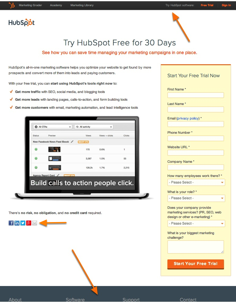
When you direct visitors to a different page on your website, you’re giving them an escape route, and it kills your conversion rate. Here are two case studies that show you how.
HubSpot tested two versions of a post-click landing page — one with navigation links, and one without:
- Version A: Control landing page with top navigation, footer navigation, and social media share links
- Version B: Removed all external links, including the top navigation, footer navigation, and social media share links

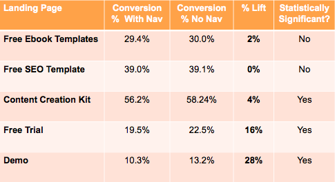
According to these A/B test results, removing links from landing pages can result in higher conversion rates. Here is the raw data:

Although it’s been mentioned already, it’s still worth repeating: Navigation links dramatically reduce conversion rates.
Don’t use Visual junk
When it comes to drawing visitors’ attention, distracting elements can be helpful. However, marketers should not saturate their landing pages with unnecessary visuals.
- Visitors are more likely to act if your website is simple, even, and white-spaced.
- Use large fonts to draw attention rather than lots of words to highlight the essential points.
- Readers can scan text more easily with bullet points.
- A video can boost conversions by as much as 80%, so consider presenting a narrative or an instructional video on your landing page.
- Incorporate relevant graphs, statistics, and press mentions into your landing page whenever possible since these help build credibility for your product.
Don’t Ignore the Tracking Pixels:
Don’t ignore the tracking pixels required to build a good audience base for your PPC landing page. If you don’t have tracking pixels on the landing page, you’ll not be able to determine how successful your PPC campaign is. So, make sure that you don’t miss out on this element. Also, create separate pages for target ads so that you can get an accurate picture of various metrics such as page views, click-through rate, conversion rate, etc.
Don’t Forget To Test Your Landing Page.
Developing effective landing pages isn’t a one-size-fits-all process. What works for one website might not necessarily work the same for another. Choosing the most effective design requires trial and error.
Testing your landing page versions is essential to find the version that works best within the context of your business. Otherwise, you might be losing out on a lot of potential conversions.
Consider testing the following features:
- Headline
- CTA
- Button size and placement
- number of form fields
- Images
- Right, left, or center column design
- Colors
Just remember to test each variant one at a time — if you change five different elements, you won’t know which impacted conversions.
As this article clearly suggests, creating high-converting landing pages is both an art and a science!
You can get the conversions of your dreams when you put together all the right elements. But add something that doesn’t belong, and your audience will leave!
While the contents of a good landing page are important, don’t forget that an intelligent builder like HubSpot Landing Page Builder is what will allow you to materialize your pages!

Thank you for submitting the details!
We will keep your information safe. Feel free to contact us with any questions at hello@uplers.com
Please check your email for next steps shared by Robert.


