6 Mantras to Design an Engaging ‘Contact Us’ Page
- Jack Mentha
- May 24, 2017
- 6 Minute Read

‘Contact us’ – is the quintessential last mile of converting visitors into customers on your website. After going through your website and finding a new sense of trust in your brand, visitors would like to connect with you and it’s there that you are either able to make it or break it.
By designing a great contact us page, and subsequently enjoying the rewards on the same – businesses have started realizing the significance of a contact us page on their website. But, just because something is important, doesn’t necessarily mean that everyone is doing it correctly.
A staggering 51% of people consider contact information as the most important element missing from the company website. Even now, companies still struggle to come up with a decent, if not great, Contact Us page. Sometimes, the reason why a Contact Us page loses its fervor is because of incompetence and carelessness.
Remembering these 6 things while creating your Contact Us page will save you both money and qualified leads.
1. Bad grammar
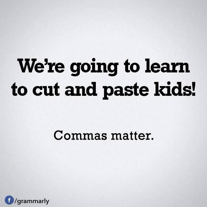
Incorrect grammar usage can lead to the death of your business. Imagine a restaurant chain’s website having a Contact Us page, with a subheading that goes something like this:
Call for delivery and enjoy ‘‘clean’’ food!
It’s not merely about skipping your P’s and Q’s, it’s about the message that you put across. Right at the last stage where the customer would be on the verge of getting converted into a qualified lead, a punctuation blunder like this giving a sarcastic notion about the food being clean can damage the reputation of your brand.
Customers might find that funny, but they will never spend a single dime for utilizing the services of a company that won’t even proofread their Contact Us page.
When it comes to checking your grammar, make sure that you proofread the entire website and not just the Contact Us page.
According to a UK study, the biggest complaint people have with brands on social media is bad grammar.
Using lingos and slangs may be grammatically incorrect but they are used to maintain the conversation language in the text to get better engagement with the audience.
Here is an example how you might take many grammar liberties, but none of them allow you to misspell the name of the company, you represent to work for.

2. Eas30y navigation to the page
The core relevance of a Contact Us page is to easily provide means of contact to your visitors. The sooner they find the Contact Us page on your website, the faster you get conversions.
Create a simple navigation for your Contact Us page and don’t fall into the trap of making your website navigation complicated in an effort to make it all glitzy and glamorous. Use common words like ‘Contact Us’, ‘Customer Support’ and ‘Help’ to enable users to locate your contact page instantly.
Users on your website must know that you are always reachable and that they can contact you at their convenience. It gives a sense of comfort and trust to your visitors. Providing contact information just above the ‘contact’ tab makes it easy for users to find your Contact Us page without much time waste.
3. Humanize the page through customer support
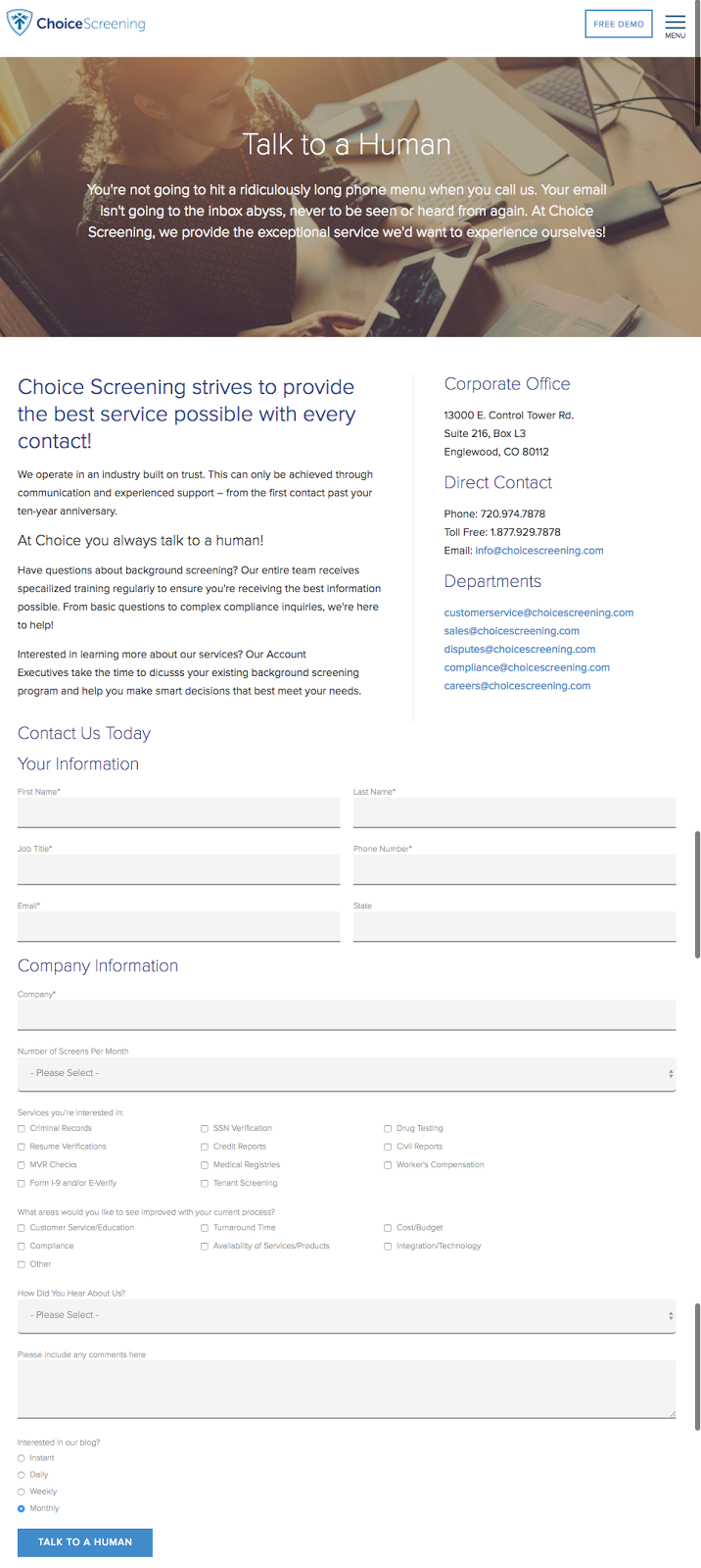
The Contact Us page design must show that there are people to assist them with all their support needs. It is this notion of human presence that will make your users trust your products and services.
But merely talking about the Customer Support won’t work, efficiency plays a big role as well. The example shows how humanizing your Contact Us page can add more value to your offering.
4. The Element of Friendliness
Imagine customers with genuine grievances trying to contact you but ending up spending a chunk of their time filling up long and meaningless forms.
Optimize your contact forms to make your page more user-friendly. Mentioned below are some tips that are guaranteed to make your Contact Us page friendlier.
• Make it non-stressful – Make sure you ask only for the mandatory information you would need to help out the customer instead of vague questions that would tire out your customer eventually making him want to quit the website.
.
• Make use of the right fonts – Use the right font size and format to keep it readable and clean.
• Make it interactive – Design the form in an interactive way to encourage users to happily fill up the form.
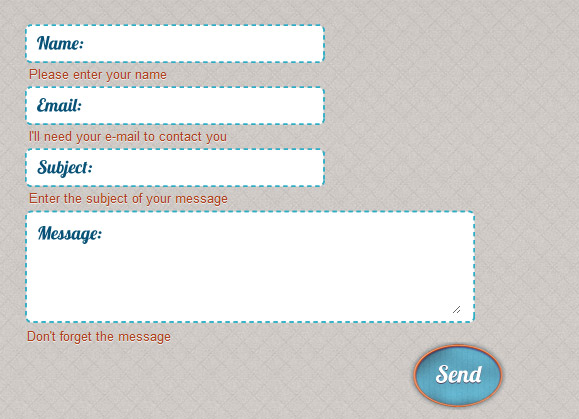
Here is an example of how you can make a simple form a little more interesting:
5. Brand It
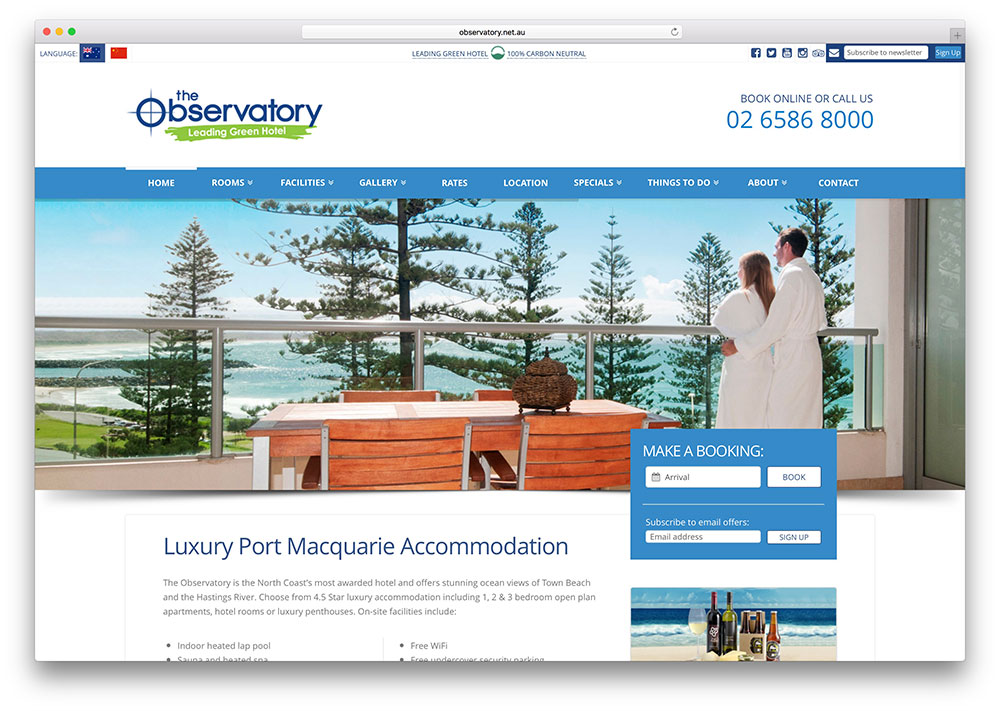
The last mile in targeting your potential customers on your website means that you need to bring your A-game when it comes to brand marketing. Your Contact Us page needs to embrace your brand image at its finest. A synergy must be maintained between the other pages of your website and the Contact Us page.
The difference in brand elements might affect user trust and create confusion, which can discourage customers from contact with you. In order to make your contact page hit spot on with your brand, here are a few quickies that can help you master the art of branding your contact page:
• Brand color – Make sure that you have used the same color to design the Contact Us page as well as the other pages of your website because one of the few elements that immediately make the users think of your brand is the brand color used in your website.
• Brand visuals – Reuse visuals that are associated with your brand, to create strong brand recognition among users.
• Placement of the brand logo – Make sure that the brand logo is placed on the same section in the Contact Us page as compared to other pages of your website. Changes in the placement of the brand logo might deviate your user’s attention from the things that you have to offer on your Contact Us page to look around the page for your logo.
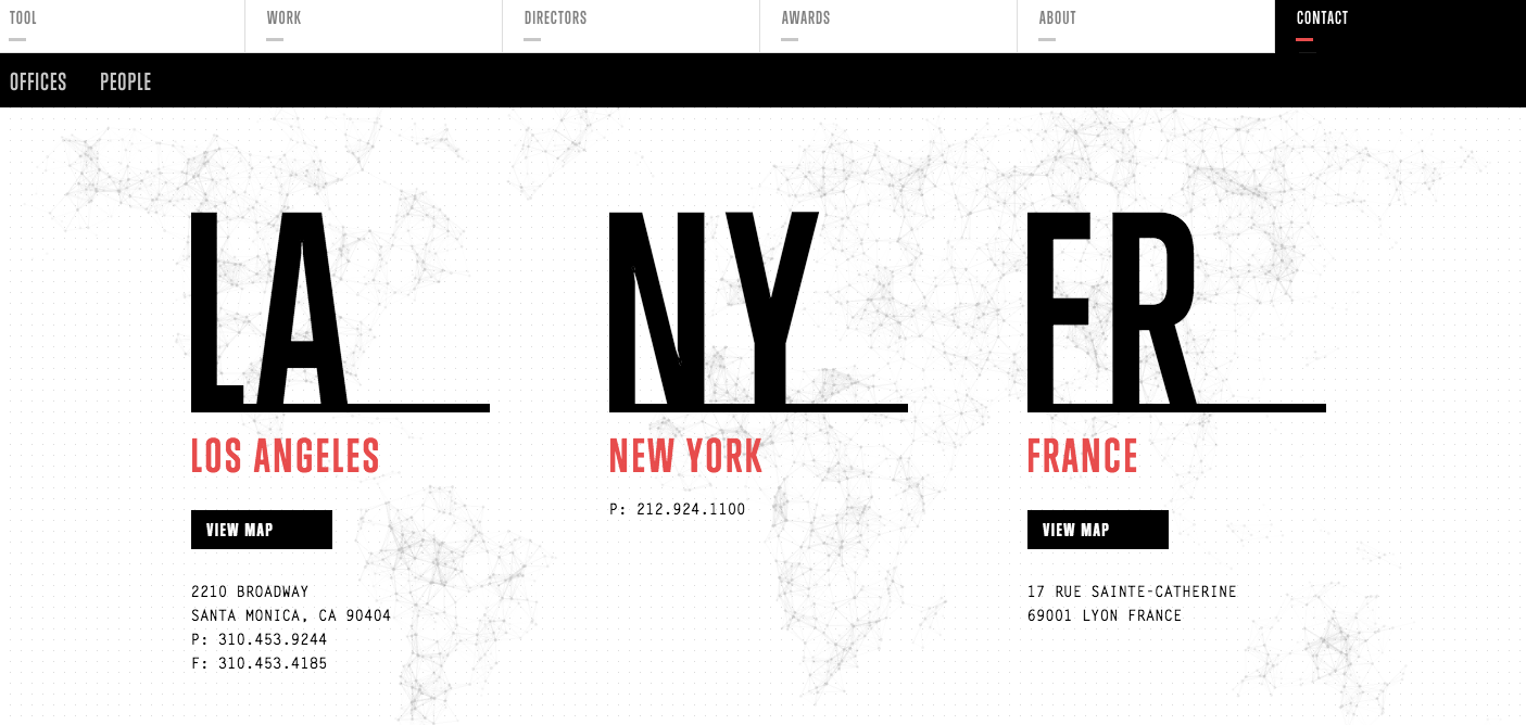
Consistency in branding is what you should aim for while designing your Contact Us page. Here is an example of how Contact Us pages are used to depict that a brand is international, just by the way it mentions its office locations.
6. Make it resourceful
With all things said, your Contact Us page needs to be responsive to user’s needs because no matter how attractive and engaging it is but if it is not able to address to and solve customer problems, your Contact Us page will not add much value to your business.
Enable your Contact Us page with a live chat feature to address customer pain points as quickly as possible.
While choosing your Contact Us page template, make sure that you consider FAQs to be a part of your Contact Us page. FAQs are time saving and they also ease the burden of users and your support team by targeting to the most common doubts.
If you are not sure about the list of questions to be included, analyze the customer feedback you have collected, find out the most frequently cited problems or concerns and ensure that you have answers for all of them.
FAQs that show the amount of research done for it and the frequent updates done to it will evince you as an expert in your industry to the users.
This resurrects your position and builds trust among users.
To design a good FAQ for your contact page, use these hacks:
• SEO friendly – Your FAQ copy should be optimized with keywords, so it comes up within relevant search results.
• Be specific with a tinge of clarity – Write answers that are to the point so that readers get satisfied by the answers that you have provided without getting bored.
• The right template – Web designers need to come up with a template that works well with the tone of your website.
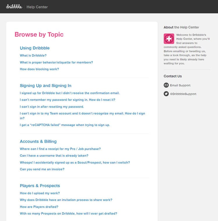
• Create the outline – Design an outline mentioning the topics that have been covered in the FAQ. That will help users directly navigate to the issues that concern them.
Here is an example, how you can craft a good outline for your FAQ:
Wrapping up
Give extra attention to designing your Contact Us page, since it affects the number of leads your business would generate. In the end, the goal of creating an effective Contact Us page should be to make sure that users can easily contact you and express their needs.

Thank you for submitting the details!
We will keep your information safe. Feel free to contact us with any questions at hello@uplers.com
Please check your email for next steps shared by Robert.


