45 Question Checklist That Will Revamp Your Landing Page Strategy
- Jack Mentha
- June 15, 2017
- 7 Minute Read

Landing page is such a simple concept. They provide a great platform to generate leads with appropriate content, forms, and calls-to-action. If you have these elements and promote them across various channels you are going well with the landing page campaign, right?
At the basic level this is enough. However, you could lose on valuable traffic and leads if you are just following the essentials. Our questionnaire could be used as a quick checklist for a complete landing page building process from the scratch. It not only works at the top level of the funnel, but across all the levels where you plan to nurture the leads.
Overburdened with expectations! Do we look upon like this at landing pages? Expectations could become reality with a well-built landing page.
What Is A Landing Page?
By definition, a landing page provides value to your visitors, who in turn agree to share their information with your business by filling out a form.
The value you provide should be packaged in attractive add-ons namely, layout, content, colour, forms and calls-to-action to get into the nerves of your visitors.
We have generated a 45 point checklist that every landing page has to go through in order to ensure that it stays rooted to the inbound methodology and delivers a unique experience to visitors at all levels of the marketing funnel. Here is the summary of the points covered in this guide:
- Identify Goals
- Identify Audience
- Value offer
- Landing page copy
- Calls-to-action
- Visual elements
- Form
- Design
- Measure
The upcoming section will be your ultimate guide to create successful landing pages for your visitors at various stages of the buyer’s journey.
The Quickest Guide to Create Landing Pages That Convert
Identify Goals
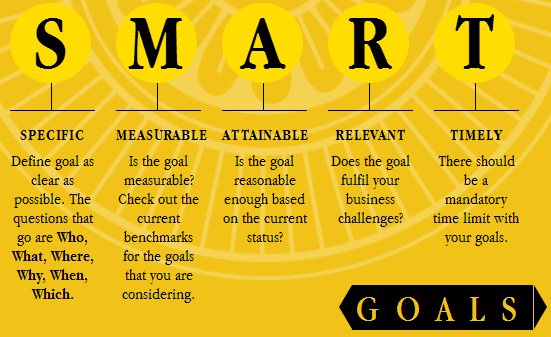
Goals help you give meaning to the landing pages by setting up baseline and expectations.
- Are your goals specific?
Your goal should show the current benchmarks, expectation, percentages, and time in order to be very specific.
- Are your goals measurable?
You should have concrete data on hand to compare the current and past results to measure progress.
- Are your goals attainable?
Your goals should be realistic and possible for your team to achieve.
- Are your goals relevant?
Your goals should be tied up to your business and address a relevant cause.
- Are your goals timely?
Keep an expected and realistic date to reach your goals.
(Image Source: 7 mantras of inbound marketing)
Identify Audience
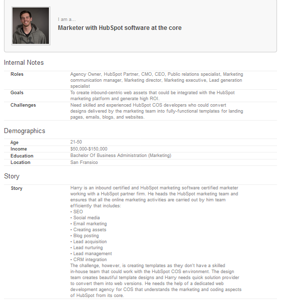
As a marketer, you need to create experiences that clearly communicate value for the audience. So, it becomes crucial to craft the design, content, and experience with personas in mind.
- Are you identifying the biggest challenges of your personas?
Your landing page is created to help your audience achieve their goals. The offer should provide a solution and it starts from identification of their needs.
- Are you identifying their online behaviour?
Find out how they consume information online. Are they active on Twitter, Facebook or other social channels? Figure out the search terms used by them to find information.
Offer
An eye-popping incentive is half the battle won when you are creating a landing page development. The following characteristics should be considered while creating an offer:
- Is it relevant?
Will your target audience be interested in the offer once they click on the search results, social media post, or email link?
- Is it valuable?
Your offer should commit to help them reach their goal or overcome a challenge.
- Is it timely?
Are you providing appropriate offer based on the life-cycle of the prospects?
- Landing Page Copy
This copy will speak about the offer and its value for the visitors. Landing page copy should be created in advance so that the structure could be easily decided.
- Is the headline concise?
Use an actionable headline that clearly talks about the value offer.
- Is the headline matching the ad, search result, email link that visitors clicked on?
Maintain consistency throughout the journey and avoid any friction. The headline should talk about the promise in the previous step.
- Have you described the offer?
With a clear description, users feel confident about their decision to visit your page and look forward to know the benefits.
- Have you inserted bullet points?
A systematic flow of benefits with the help of bullet points will help users understand the value offer better.
- Have you inserted call-to-action?
In addition to the form, having buttons across prominent places on landing page especially above the fold will increase conversion rates.
- Have you inserted testimonials?
Client testimonials will make the trust factor rock-solid and boost conversions.
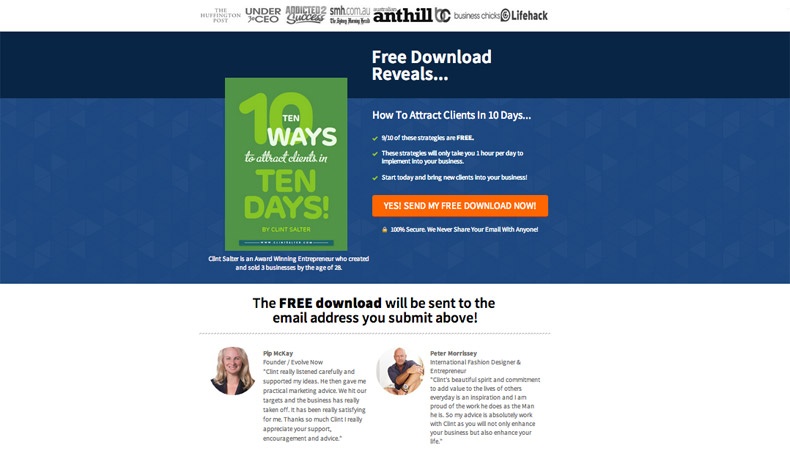
Are you mentioning awards and certifications?
Display the most popular awards and certifications with logos to set up the expectation.

Are you personalizing the copy?
Personalization undoubtedly includes addressing the prospect with their names. But it essentially includes addressing the buyer’s journey your prospects are in and providing relevant landing page content. This is possible when you segment your leads on the basis of their journey and associate the landing pages to them by sending targeted emails.
Call-to-Action
- Does your CTA clearly provide what is promised?
Your CTA should complement the complete journey the visitor has been through. A Call To Action should only help achieve the visitor’s goals.
- Are the CTAs prominent?
Don’t lose any chance to make your CTA visible at regular intervals.
- Is the CTA complementing in color?
These are colors that appear opposite to each other in the color wheel. These colors make each other brighter when brought together.
- Is the CTA creating a sense of urgency?
The CTA copy should include action-oriented language and generate a sense of urgency to trigger action.
- Are you showing directional signals for the CTA?
Subtle directional signals towards the CTA will help the users know how to avail your offer. These signals will entice the users while they go through the key sections of the copy.
Visual Elements
The brain has the ability to process information via visuals faster than text. Let’s take a look at the necessary visual components:
- Does your landing page have a hero shot?
A hero shot is the first opportunity to build important trust. An image inside the hero shot should reinforce the message of the landing page.
- Have you inserted a video with an attractive still shot?
A video proves to be a great eye-catcher on the hero shot or even below the fold. It should have enough substance to engage visitors.
- Have you inserted images at appropriate places?
If there is an eBook or whitepaper, insert an image of the cover page. Similarly add images that communicate about the offer/product/service to reinforce the value.
Forms
This is where your conversion funnel gets the momentum. The form should suffice all of the following requirements:
- Are the forms easily scannable?
Labels should be properly aligned with the fields and grouped together to differentiate from other fields. Differentiate various sections to avoid clutter.
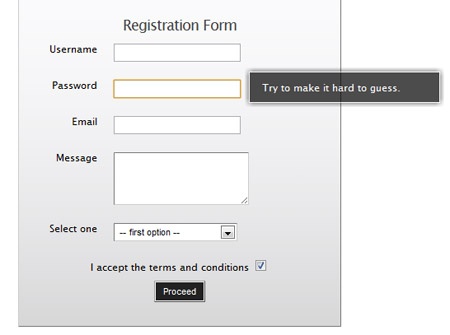
- Is there enough assistance available on your form?
Insert tool-tips for your fields to guide the users about the requirements of a selected field.
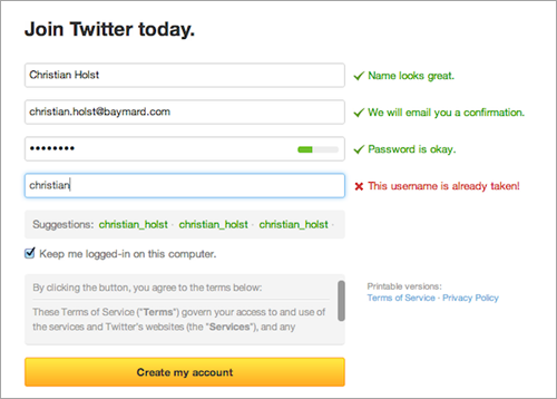
- Is the form validating the data entered by users?
Users should be guided about the authenticity of the data entered by them. Let them know with relevant messages whether they have entered correct or wrong information.
Design
Your landing page design will typically be decided once you have the landing page copy ready with images and call-to-action copy. The inevitable design elements are given below.
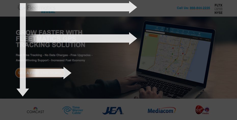
- Does your landing page follow the F-pattern?
According to the F-pattern report by the Nielsen Norman Group users will start in the top left and scan the page in F pattern. Key landing page elements should follow this pattern.
- Is your landing page device responsive?
Your landing page should be accessible on desktops, tablets, and mobiles. Ensure that the users don’t have to pinch and zoom on the mobile or scroll left and right to read text.
- Is the loading time low?
Ensure that the loading time of your page is not more than 3 seconds. If not, visitors will leave and your engagement rate will suffer.
- Have you inserted the company logo?
You do not want to miss out brand awareness. Let the visitors know who you are by making your logo prominent on the page.
- Have you removed navigation links and other links throughout the landing page?
More the links, more the chances of your visitors heading to other sections of your website! You don’t want this to happen. Let them stay and fill out the form or click the CTA.
- Have you taken extreme care with colors?
Color psychology works online and triggers the users decision to engage. Here are some areas where you will need to work.
Background: Ensure that the background color doesn’t interfere with the text.
Link Color: It is not recommended to have links in the copy at all. However, if you should have them start with blue or maroon links.
Call-to-action colors: Use complementary colors. More information above in “call-to action.”
Measure
For a marketer, analytics is everything. You need to know if your landing page is capable of generating engagement and ROI.
- Have you created different versions of the landing pages with variations to A/B test and check their individual performance?
- Are you keeping a track of all the visits to the landing pages?
- Which channels are the most effective in terms of traffic?
- How many leads have been generated via the landing page?
- What is the conversion ratio of traffic to lead?
- What is the conversion ratio of lead to customer?
- What is cost per acquisition?
- What is cost per customer?
- What is the ROI of each promotion channel?
- What is the bounce rate?

Thank you for submitting the details!
We will keep your information safe. Feel free to contact us with any questions at hello@uplers.com
Please check your email for next steps shared by Robert.


